The Hunt is Over
Description
Diana Depot is a unique vegan food depot located in Greenwich Village, New York City. The cuisine centers around Italian and Mediterranean food while using no animal products. With a variety of classic ethnic take-out options, as well as an array of vegan food products, Diana Depot serves as a one-stop shop for all things animal friendly.
Environment
The location of Diana Depot is intimate and deli-like. The environment showcases a stone exterior with signage and an awning. The interior is a deli counter with a brand banner behind it.
Ideation Process
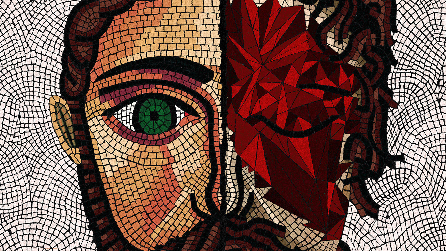
Art history has always been a thing that has fascinated me. Seeing the different symbols and characters that have been celebrated throughout history gives one a window into the past so we can see what preceded us in our present day. Diana, being the god of the hunt, presented an opportunity to turn her title on its head. Making the goddess of the hunt an icon for a vegan depot seemed like an interesting contradiction that could play to the brand's advantage. Diana also gives an opportunity to create a narrative of what we consume in the modern day versus ancient times.
For the aesthetic, I wanted to work in something that I have a personal affinity for. Aside from art history being at play I also love the medium of collage and find it is an often underrated art form. Since my mid-teens, I have been making punk flyers for shows so I thought I would take that process and push it into a focused direction.
Menu
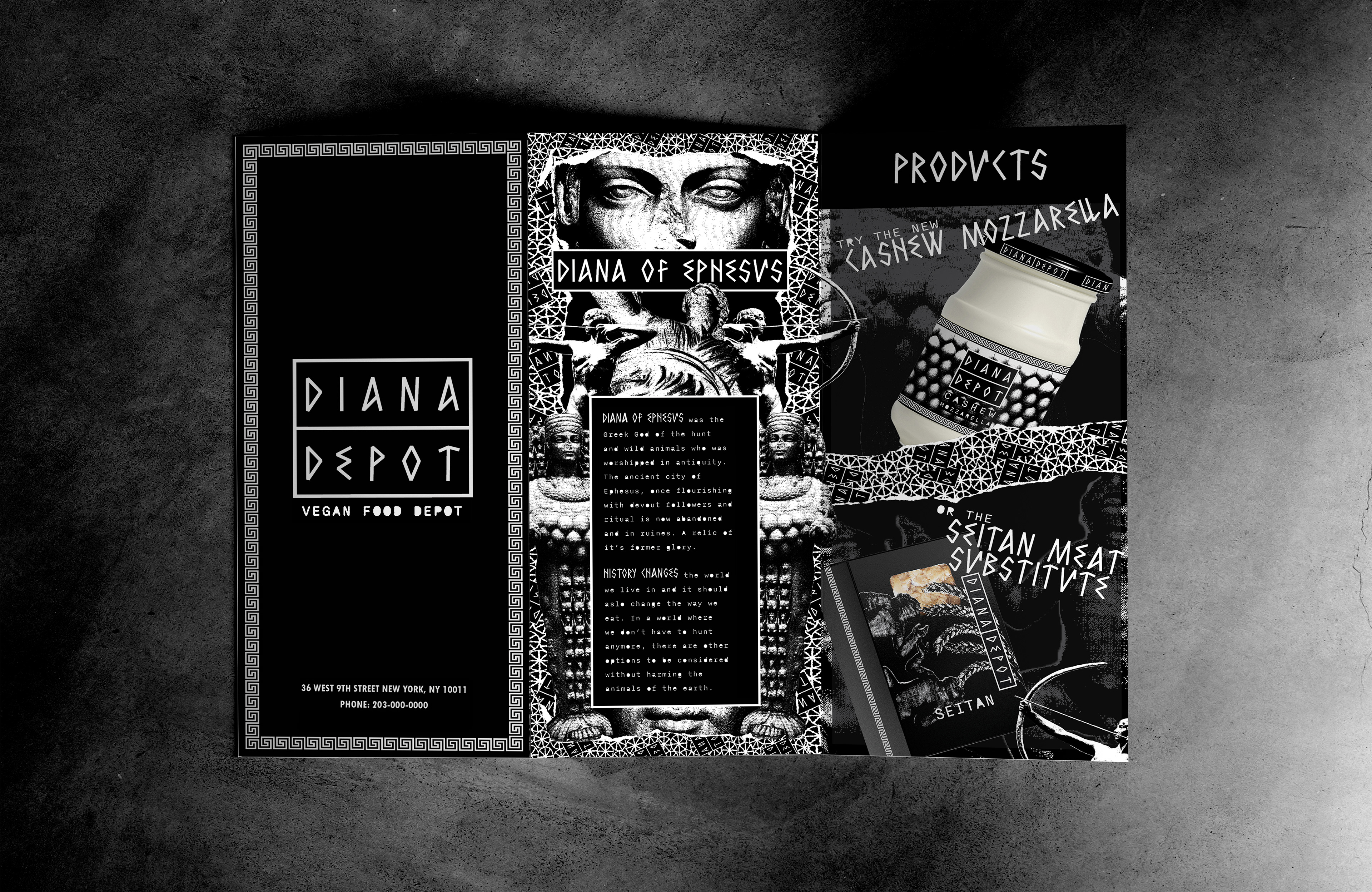
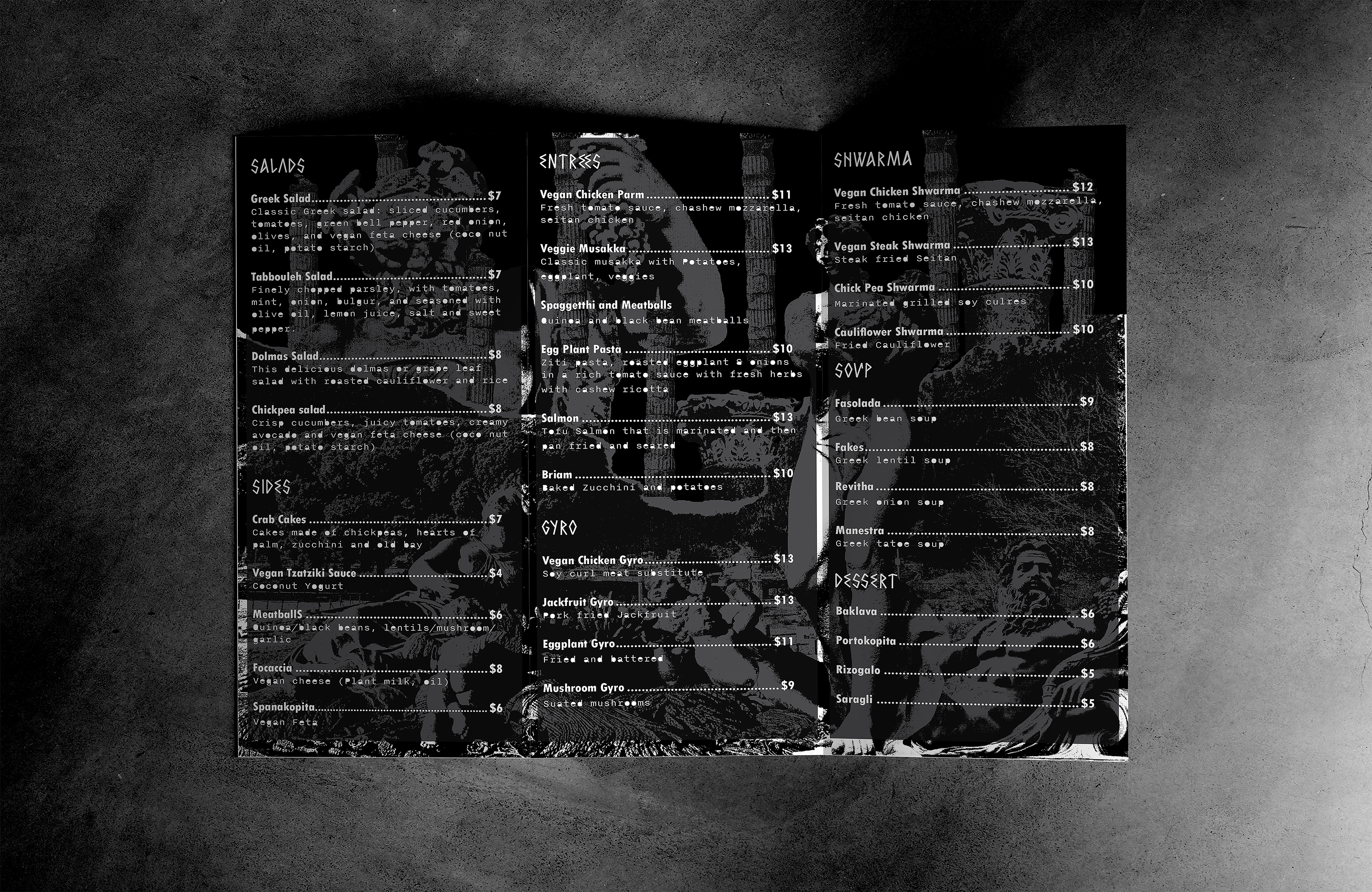
The menu features collage artwork of Diana and other ancient Greek characters, as well as the statement of purpose. Listed are classic Greek and Italian dishes that reveal their vegan product substitutes. Ads for various products are also featured. I chose a tri-fold menu because Diana Depot is a small-scale take-out restaurant. Additionally placing ads for products is more feasible when menus can be taken out of the store.
Statement of Purpose
“DIANA OF EPHESUS was the Greek God of the hunt and wild animals who was worshiped in antiquity. The ancient city of Ephesus, once flourishing with devout followers and ritual is now abandoned and in ruins. A relic of its former glory. HISTORY CHANGES the world we live in, and it should also change the way we eat. In a world where we don’t have to hunt anymore, there are other options to be considered without harming the animals of the earth.”
Packaging
When designing the packaging I wanted to take Greek and Roman art and fit it into the narrative of the brand. Using a collage style gives one the ability to mix and match symbols and objects, which I use to the advantage of the design.
The IXOYE pasta features Demeter, the Greek god of grain. The pasta is a wagon wheel shape but instead labeled IXOYE, which is a wheel-like symbol found in the ancient city of Ephesus. The IXOYE is one of the first Christian symbols ever used in history. All these parts give credence to both the location of Ephesus and its history.
The Seitan packaging has Romulus and Remis on the front, who were the two brothers at the center of the origin of the ancient Roman Empire. However, instead of being fed by the wolf, they are consuming grain. Grain, in addition to being a non-animal product, is what Seitan is typically made from.
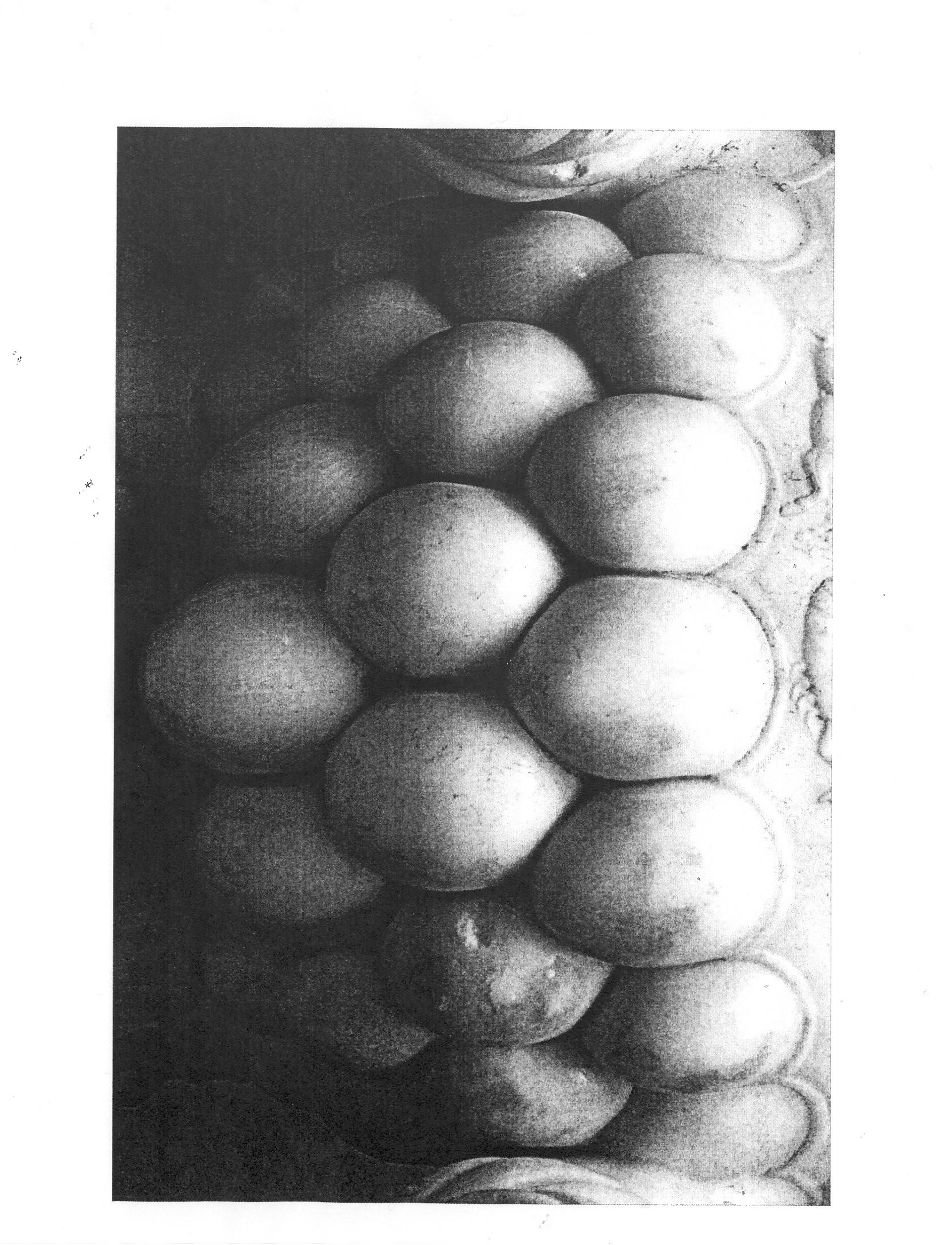
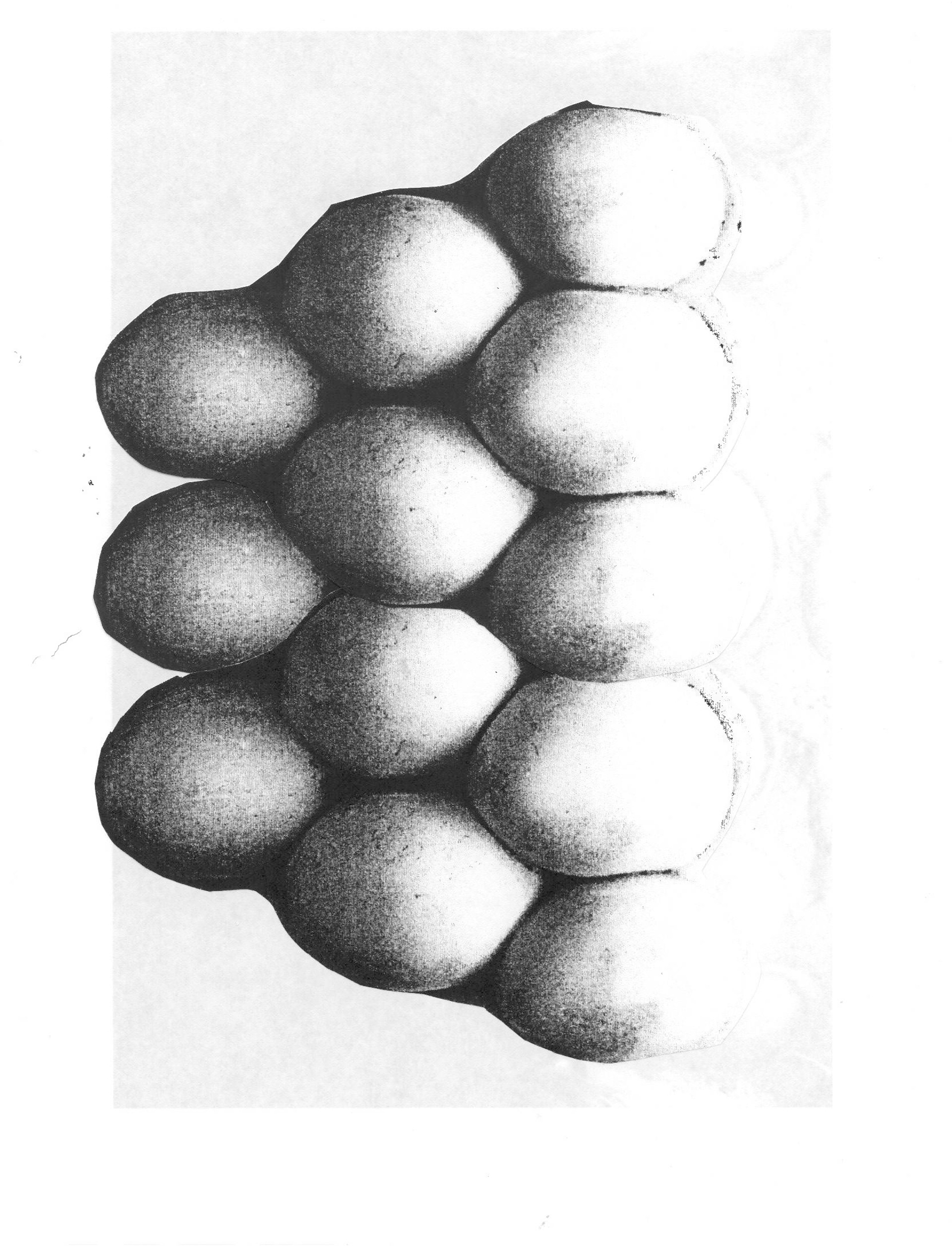
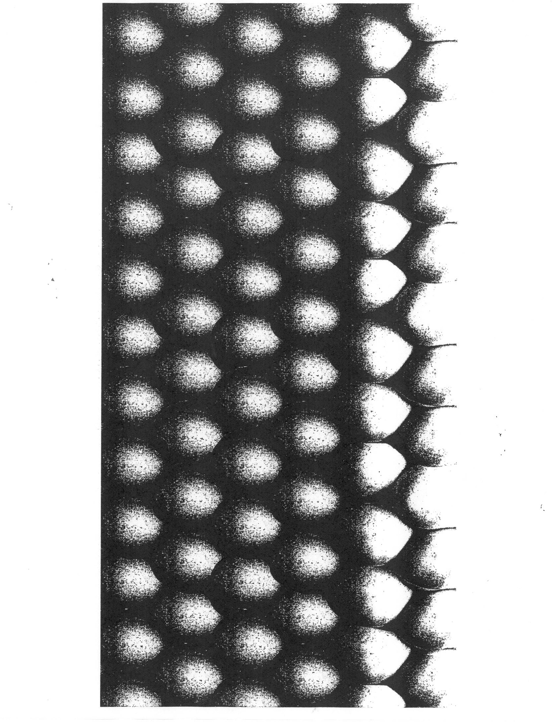
The Cashew Mozzarella design is inspired by one of the oldest depictions of Diana. This particular depiction of Diana exhibits her with multiple breasts, which I cut out of a photo and then repeated to make the pattern. Fitting for the faux dairy product.
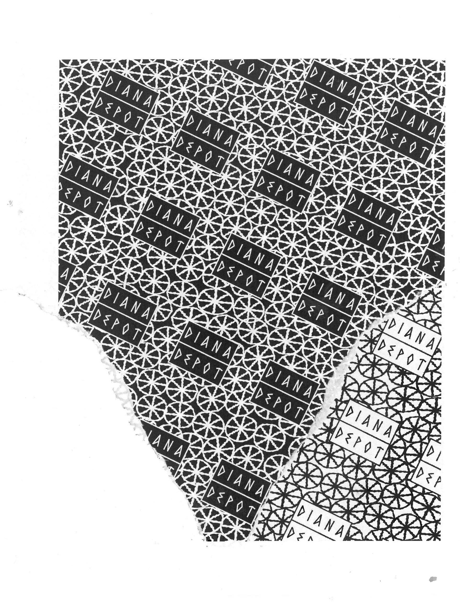
This gyro mock-up features Diana Depot tissue paper with a black and white variation of the brand pattern. The pattern includes the brand logo as well as the IXOYE symbol.
Advertisement
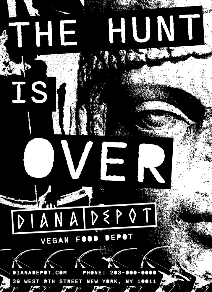
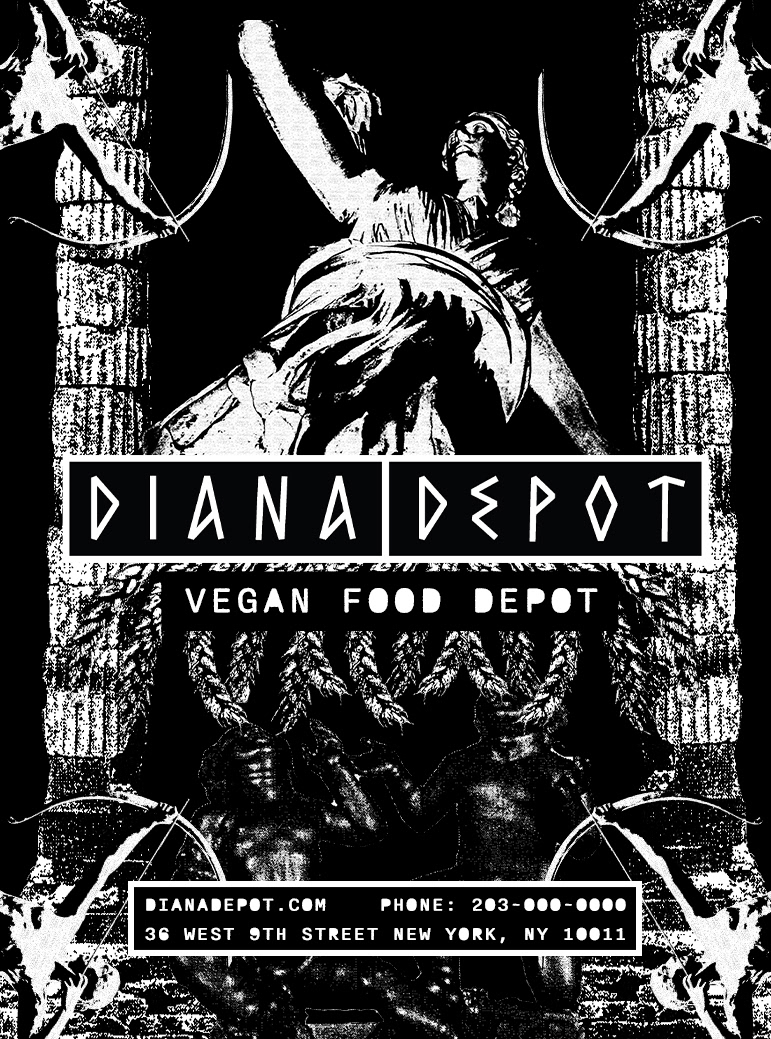
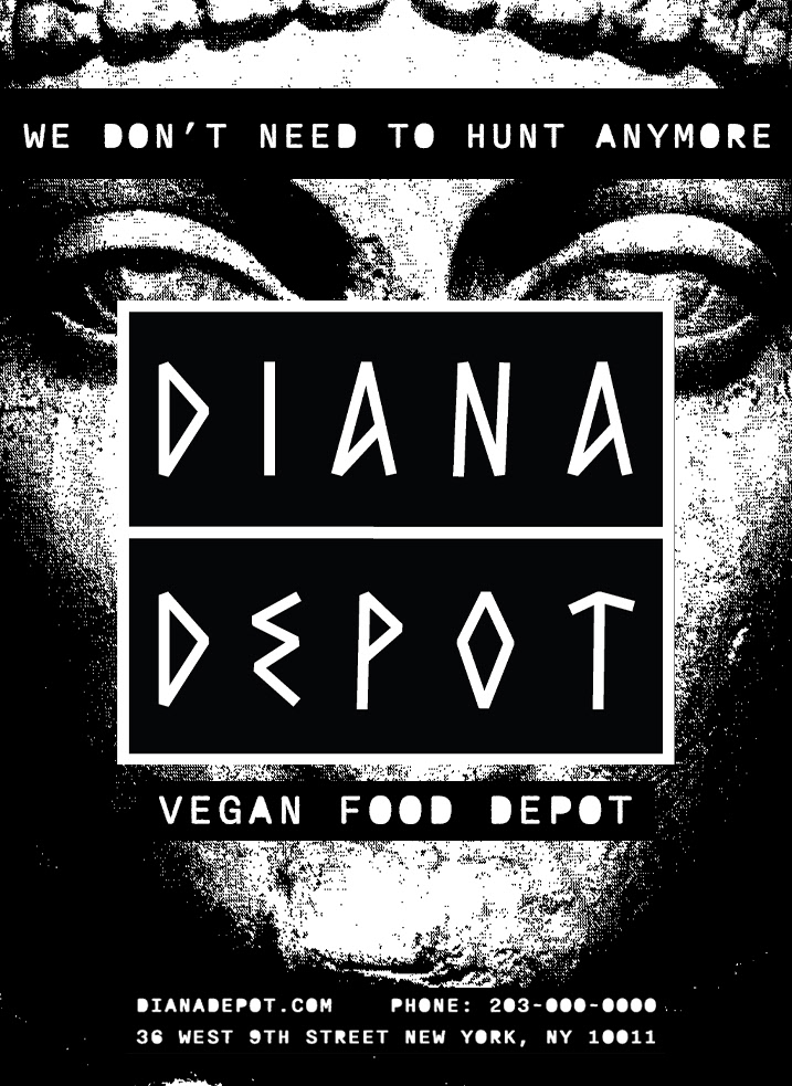
The advertisements state the slogans “The Hunt is Over” and “We Don’t Need to Hunt Anymore” to tie Diana and veganism together. The posters have Diana presented in multiple forms, intriguing passers by.
Merchandise
Diana Depots' merchandise consists of reusable bags, tee shirts, socks, and pins. The products include the brand logo, the brand pattern, and Diana's likeness in their design.
Style Tile
Logos
I designed the logo to be simple but also convey the mood of Diana Depot. I used an ancient Greek-style font to coincide with the overarching theme but present it in a way that is sleek and modern. The black and white visual contrast used in the logo is also a driving force throughout the brand.
Process
For most visual assets, I printed them out, made a photocopy, and scanned it back in to be arranged onto the products. This creates the grain and texture in the images that digital filters cannot quite replicate. I either hand-made collages or wanted to give the impression they were handmade. I often use paper rips and play with scale along with careful layering to give the arrangements depth.
Process Scans
Cashew Mozzarella breast pattern
Brand pattern with rips
Dianas’ face
Reflection
Diana Depot is an exploration of what I am capable of my design capabilities. I was able to take art history and merge it with a style I have delved into for years. This gave me the opportunity to focus and hone a style and pinpoint what works and what doesn’t when creating a brand. Collage is a medium that I have a personal connection with, and creating assets using this style that are compelling and marketable is an achievement for me. Of all the design projects I have worked on in recent years this has been the most gratifying one so far.
Credits
Designer: James Emma
Photography used from Adobe Stock
